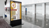
Vande Aata
Branding a local business
Designing a visual identity for a small local business and developing a design language with various digitally and physical (in print) brand assets. This identity helps the business position themselves and communicate effectively with their target audience.
This project aims at
- Setting a visual identity for credibility
- Building Brand assets for business growth
- Having a digital presence for better outreach
Context
Business in a Pandemic
As the pandemic hit Mumbai, India, one of the many markets affected was flour manufacturing. It is a common practice for the people of Mumbai to get the grains to a flour manufacturer and get the flour right away. The flour in the supermarket is not preferred as the dough is sometimes loose or the rotis are relatively hard.
Vande aata was started to cater for this market. A flour manufacturing brand that was transparent about the grain it sourced and provided grinding/ flour manufacturing services on demand. As the business grew organically and the pandemic rules became strict, the owner intended to increase the prices to sustain the delivery aspects.
This called for a visual identity and consistent representation of business to gain credibility and go online for more exposure and customer acquisitions
Engagement
About the business
-
Women-owned
-
Local Business
-
Language: Marathi
It was a business started by the son of a housewife. They identified the problem with packed flour and ventured into a business. The son, Rohit, wanted to set up a stable source of small income for his mother.
Hence, we needed something grounded to earth, representing the owner and vernacular in language. All work needed to be simple so that the owner could manage it after the engagement without much attention. With the intent to implement my design skills and help a business owner set up a brand, I started out this journey.
Logo Design
Process:
-
Client interview
-
Moodboard ideation
-
Selecting a direction
-
Logo ideation
-
Selection
-
Final logo draft
-
English version of logo
-
Raster and vector file deliverable for colour, black & white, greyscale logos
-
Usage Guidelines


Concept:
The logo represents a housewife and a homely feel with the chapati roller pin and board. It is cultural in Maharashtra that flour is widely used for making rotis. Other flours are used to make different Indian-breads like parathas and ambolis. Moreover, it symbolises the homely nature and the owner closely associated with the elements. Hence these were used to produce the logo concept.
The colours are earthy colours to represent the ground-to-earth nature of the owner and the business

Online Presence
-
Facebook
-
Profile picture
-
Cover photo
-
Posts
-
Joining business groups
-
-
Whatsapp
-
Profile picture
-
Description
-
Catalog
-
-
Instagram
-
Profile Pic and bio
-
Posts
-


Marketing Assets
Expanding locally
The owner realized that a significant push was needed to gain online traction. Therefore, Rohit wanted to reach out to the local market close to the manufacturing unit.
In order to get local traction, Flex banners were needed to put up on storefronts and catalogue brochures were needed to hand out to people and give away at other shops and small marts.
Packaging and Catalogue
Increasing Returning customers
To boost local presence we wanted to help people reach out to the business for more orders and boost sales. What best method than to put it on the product itself?!
Thus a label was designed in compliance with FSSAI regulations so that the same labels could be used if barcodes were purchased in the future for shelf spaces in supermarkets.
Once the labels for all products were designed, we conducted a small photo shoot and catalogue photoshoot.
Finally, we also designed a festival edition of packaging far selective premium products.
Process
Since we wanted to design for long term one of the major challenges was accounting for all guidelines while keeping the packaging aesthetics and packed product visible. FSSAI (food safety regulations in India) guidelines for packaging are defined on the area of the label used. Since we had just started, we choose to remain under 100 sq.cm. We had 3 type of products- loose flour packed in transparent bags, powders packed in round boxes and festive items in sealing bags.
Optimizing for printing paper size was of absolute importance to avoid wastage. Accounting for the tolerances and human error while sticking edge-to-edge was tricky to design, but with a few iterations, we were good with that too.

.png)
Handing off
Transfer of ownership and knowledge
-
Off the shelf usable logo sets with usage guidelines
-
Colour palette and typography (marathi/devnagari & english) for content production
-
Catalog folder and product photos with transparent background
-
Assets folder
-
Account credentials(instagram, facebook, google business profile)
-
Tutorial for account settings for each
All of this was handed off on Google drive. We also had discussion on potential expansion and documentation of more brand assets in the future.
Impact
20+
New Customers
50+
Enquiries
2000+
Online Impressions


